About / Sobre
EN
_
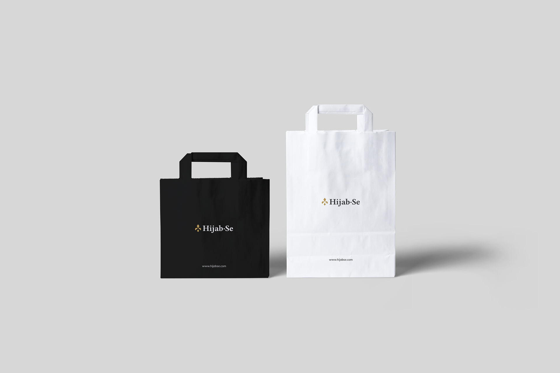
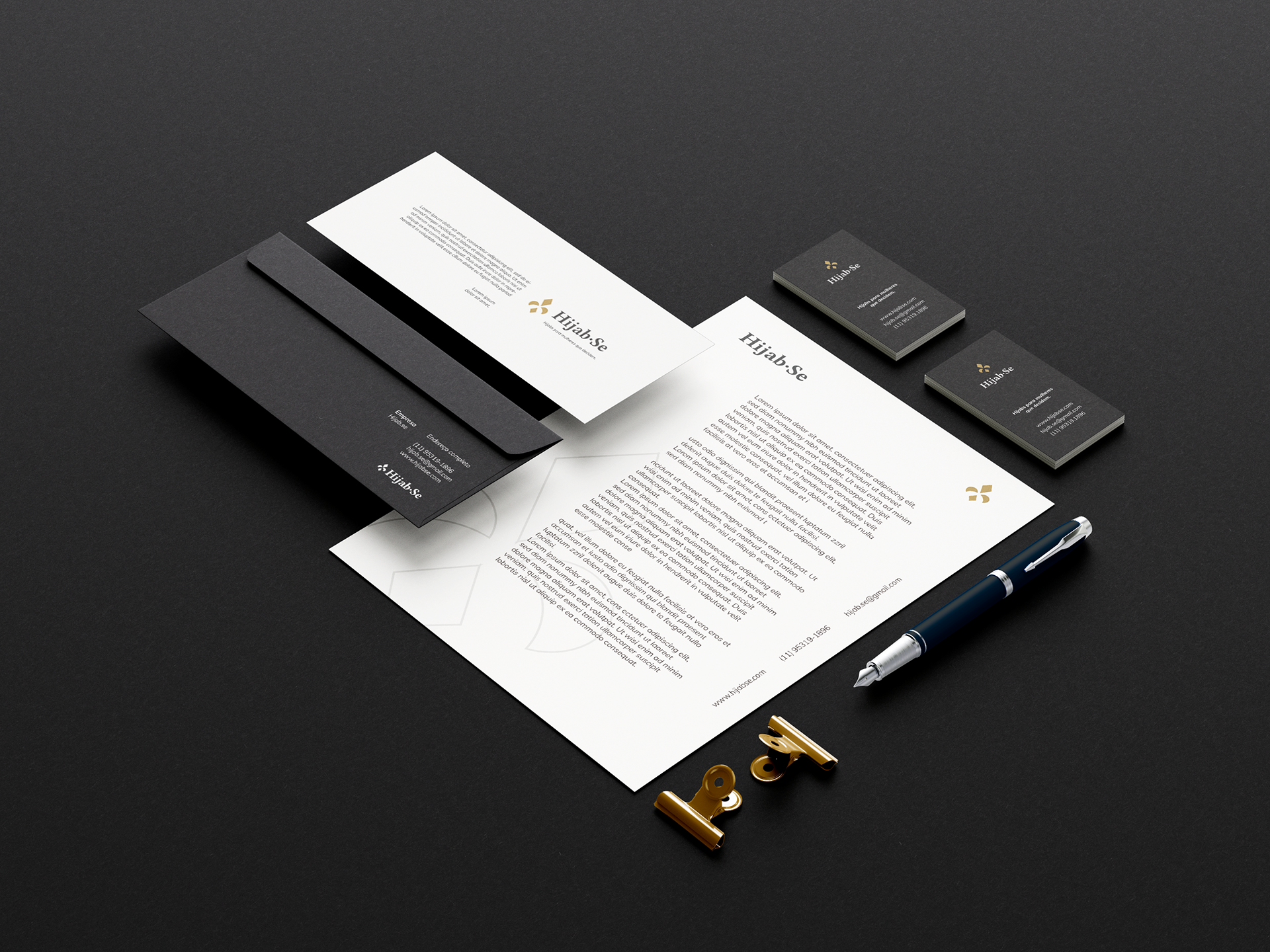
Hijab.se is a brand that produces and sells Muslim veils (hijabs), being a pioneer in the Brazilian market. More than a brand, hijab.se has become a community for Brazilian Muslim women, also offering Portuguese content on their blog.
BR
_
A hijab.se é uma marca que produz e comercializa véus muçulmanos(hijabs), sendo pioneira no mercado brasileiro. Mais do que uma marca, a hijab.se se tornou uma comunidade para as muçulmanas brasileiras, oferecendo também conteúdos em português em seu blog.

Concept/Conceito
EN
_
Hijab.se is pure, modest, elegant, exclusive and modern. Thinking about these characteristics, the final brand would need to synthesize all these sensations to be successful during the interaction with the target audience
Universal symbol of beauty and purity. The element "flower" was chosen to guide the concept of the hijab.se brand as it represents exactly the main attributes of the brand. The flower is also a symbol of the feminine.
The Half Moon (fragment of the symbol of the religion of Islam) was used in the construction of the logo to refer to Islam in a discreet but coherent way.
To complete the brand concept, the geometric shape of the rhombus was used to bring the Brazilian essence to the project. Bearing in mind that the Brazilian flag carries a diamond in its center.
The rhombus is also the shape of some valuable ores carved, usually representing refinement, quality or luxury, giving the brand a tone of elegance.
BR
_
A hijab.se é pura, modesta, elegante, exclusiva e moderna. Pensando nessas características, a marca final precisaria sintetizar todas essas sensações para ter sucesso durante a interação com o público-alvo
Símbolo universal da beleza e da pureza. O elemento "flor" foi escolhido para guiar o conceito da marca hijab.se por representar exatamente os principais atributos da marca. A flor também é símbolo do feminino.
A Meia Lua (fragmento do símbolo da religião do islã) foi utilizada na construção do logotipo para remeter ao islamismo de uma maneira discreta, porém coerente.
Para completar o conceito da marca, a forma geométrica do losango foi utilizada para trazer a essência brasileira para o projeto. Tendo em vista que e bandeira brasileira carrega um losango em seu centro. O losango também é a forma de alguns minérios valiosos talhados, normalmente representam o requinte, qualidade ou luxo, dando a marca um tom de elegância.