About/Sobre
BR
_
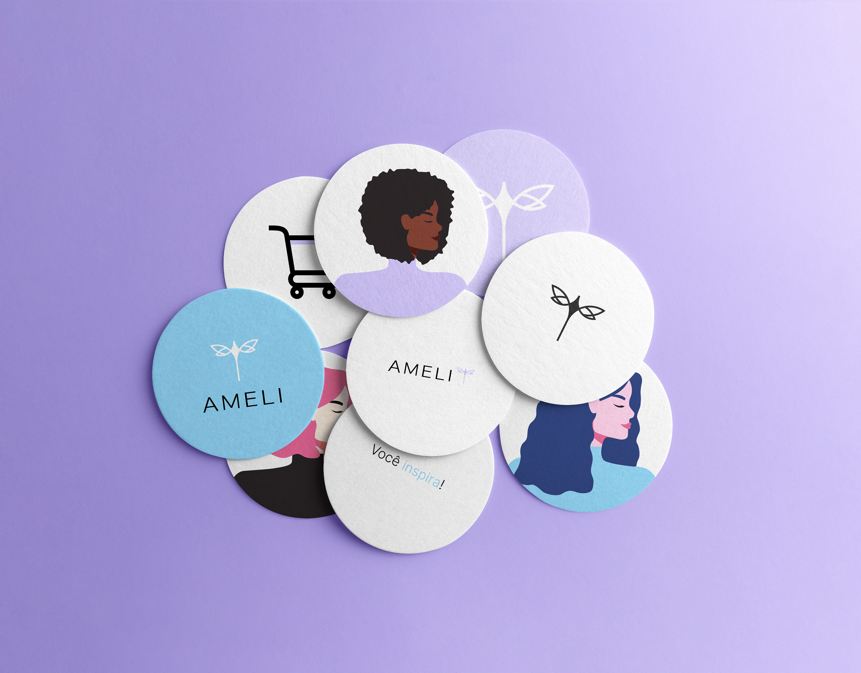
O estabelecimento, localizado em fortaleza, reúne tudo o que as mulheres precisam para se sentirem bem consigo mesmas em um único lugar.
Salão de beleza completo, comércio de produtos para tratamento capilar, confecção, perfumaria, joias e semi-jóias. Toda a atmosfera da marca gira em torno de fazer as mulheres se sentirem belas e felizes através do autocuidado.
Salão de beleza completo, comércio de produtos para tratamento capilar, confecção, perfumaria, joias e semi-jóias. Toda a atmosfera da marca gira em torno de fazer as mulheres se sentirem belas e felizes através do autocuidado.
EN
_
The establishment, located in Fortaleza, brings together everything women need to feel good about themselves in one place.
Complete beauty salon, trade in hair care products, clothing, perfumery, jewelery and semi-jewelery. The whole atmosphere of the brand revolves around making women feel beautiful and happy through self-care.
Complete beauty salon, trade in hair care products, clothing, perfumery, jewelery and semi-jewelery. The whole atmosphere of the brand revolves around making women feel beautiful and happy through self-care.

Concept/Conceito
BR
_
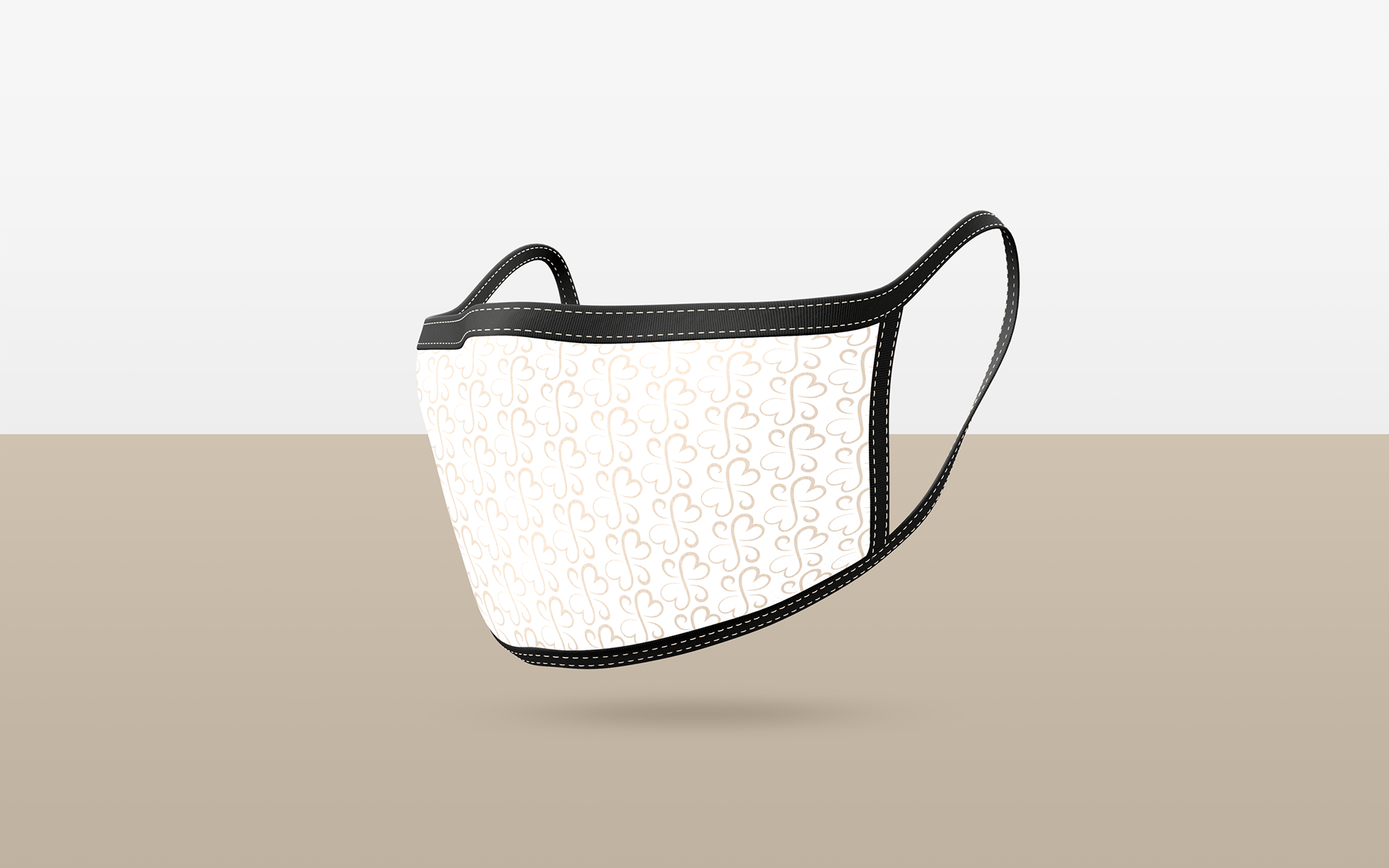
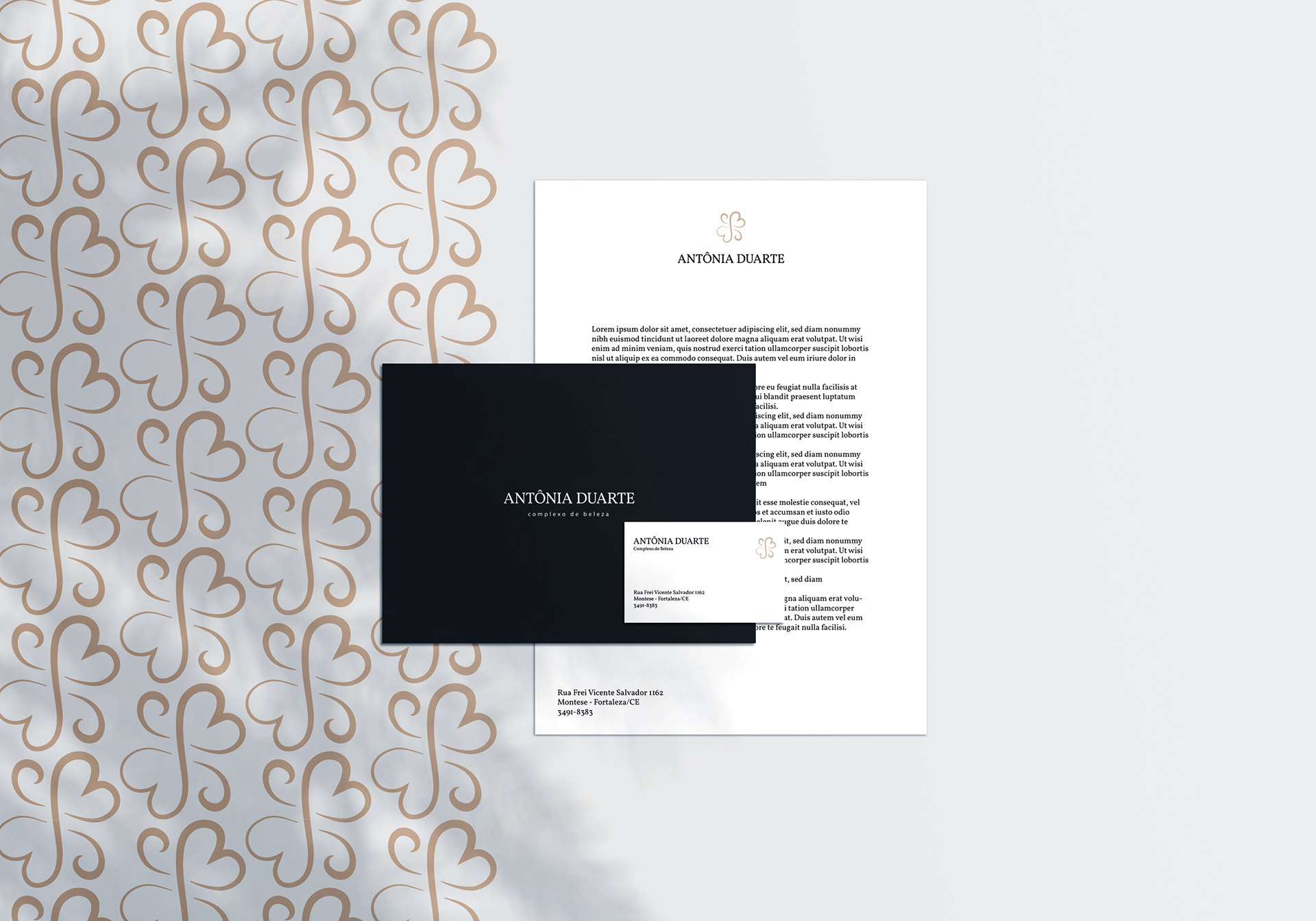
Foi percebido durante a conceituação do projeto uma forte presença do conceito amor. Amor pela profissão, amor pela vida. O símbolo do O símbolo do coração foi utilizado para remeter toda essa atmosfera amorosa que gira em torno da marca Antônia Duarte.
O Complexo de beleza Antônia Duarte, atua a mais de 30 anos no mercado. Durante esse período, foram estabelecidos fortes laços entre clientes e profissionais. O laço foi utilizado no conceito para representar essa relação duradoura e saudável.
Finalizando o conceito da marca, foi utilizado também o símbolo da flor. Isso se deve pelo fato de que as flores são consideradas símbolo universal da feminilidade, além de possuírem forte conexão com o conceito de “beleza”.
Pelo fato de o estabelecimento atuar no mercado durante todos esses anos, o conceito “tempo” também foi explorado durante a conceituação da marca. Construção de laços que vão além do tempo, pois não possuem fim.
EN
_
During the conceptualization of the project, a strong presence of the concept of love was perceived. Love of the profession, love of life. The symbol of The heart symbol was used to convey all this loving atmosphere that revolves around the brand Antônia Duarte.
The Antônia Duarte beauty complex has been operating in the market for over 30 years. During this period, strong ties were established between clients and professionals. The bond was used in the concept to represent this lasting and healthy relationship.
Finishing the brand concept, the flower symbol was also used. This is due to the fact that flowers are considered a universal symbol of femininity, in addition to having a strong connection with the concept of "beauty".
Because the establishment has been operating in the market for all these years, the concept of “time” was also explored during the conceptualization of the brand. Building bonds that go beyond time, as they have no end.