
Objective / Objetivo
EN
_
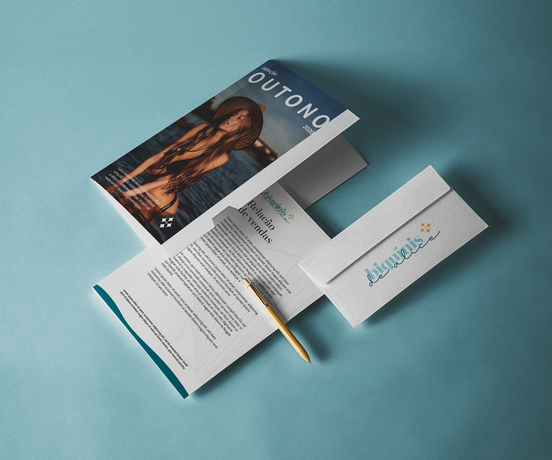
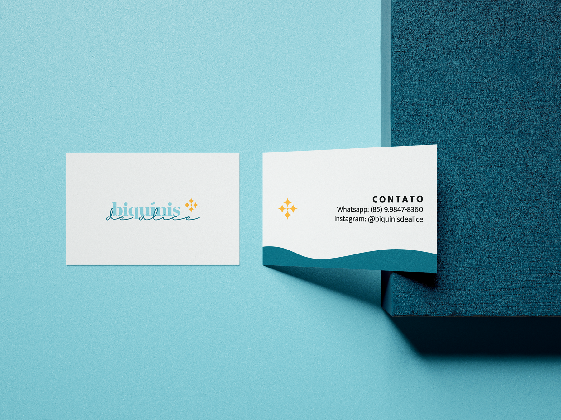
Biquínis de Alice is a beach fashion store located in Fortaleza / CE.
The brand with only 4 months in the market already has a great client base and aims to become a reference in the segment. With a predominantly female audience, identity had a need to sound modern, elegant and exclusive.
The brand with only 4 months in the market already has a great client base and aims to become a reference in the segment. With a predominantly female audience, identity had a need to sound modern, elegant and exclusive.
BR
_
A Biquínis de Alice é uma loja de moda praia localizado em Fortaleza/CE.
A marca com apenas 4 meses de mercado já possui uma ótima cartela de clientes e tem como objetivo se tornar uma referência no seguimento. Com o público predominantemente de mulheres, a identidade tinha a necessidade de soar moderna, elegante e exclusiva.
A marca com apenas 4 meses de mercado já possui uma ótima cartela de clientes e tem como objetivo se tornar uma referência no seguimento. Com o público predominantemente de mulheres, a identidade tinha a necessidade de soar moderna, elegante e exclusiva.


Concept / Conceito
EN
_
The brand concept was entirely built on the premise that each woman is unique and should shine like the sun. In addition, values such as happy moments and personal satisfaction were included and essential for the development of the project.
BR
_
O conceito da marca foi inteiramente construído em cima da premissa de que cada mulher é única e deve brilhar como o sol. Além disso, valores como momentos alegres e satisfação pessoal foram inclusos e essenciais para o desenvolvimento do projeto.


Result / Resultado
EN
_
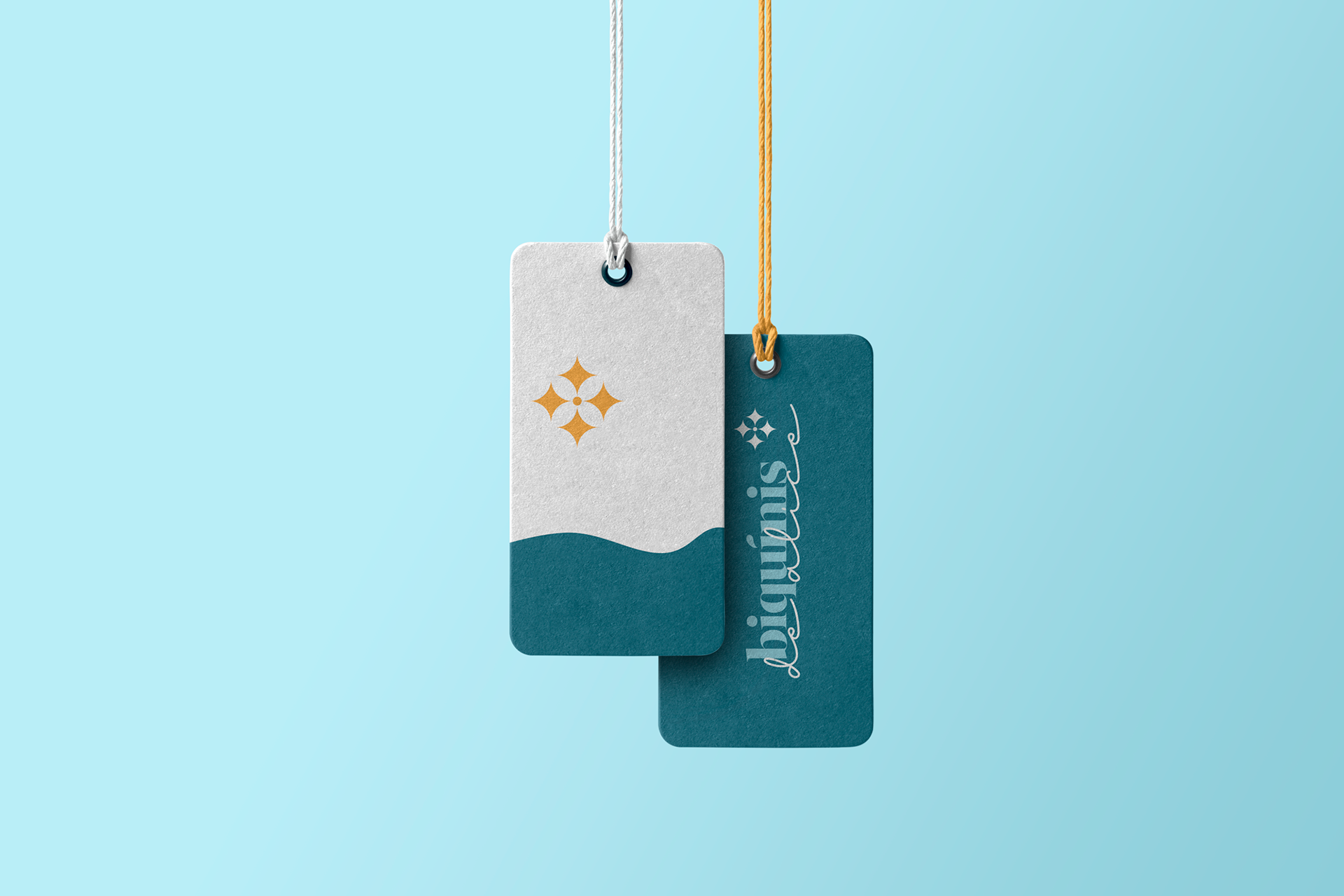
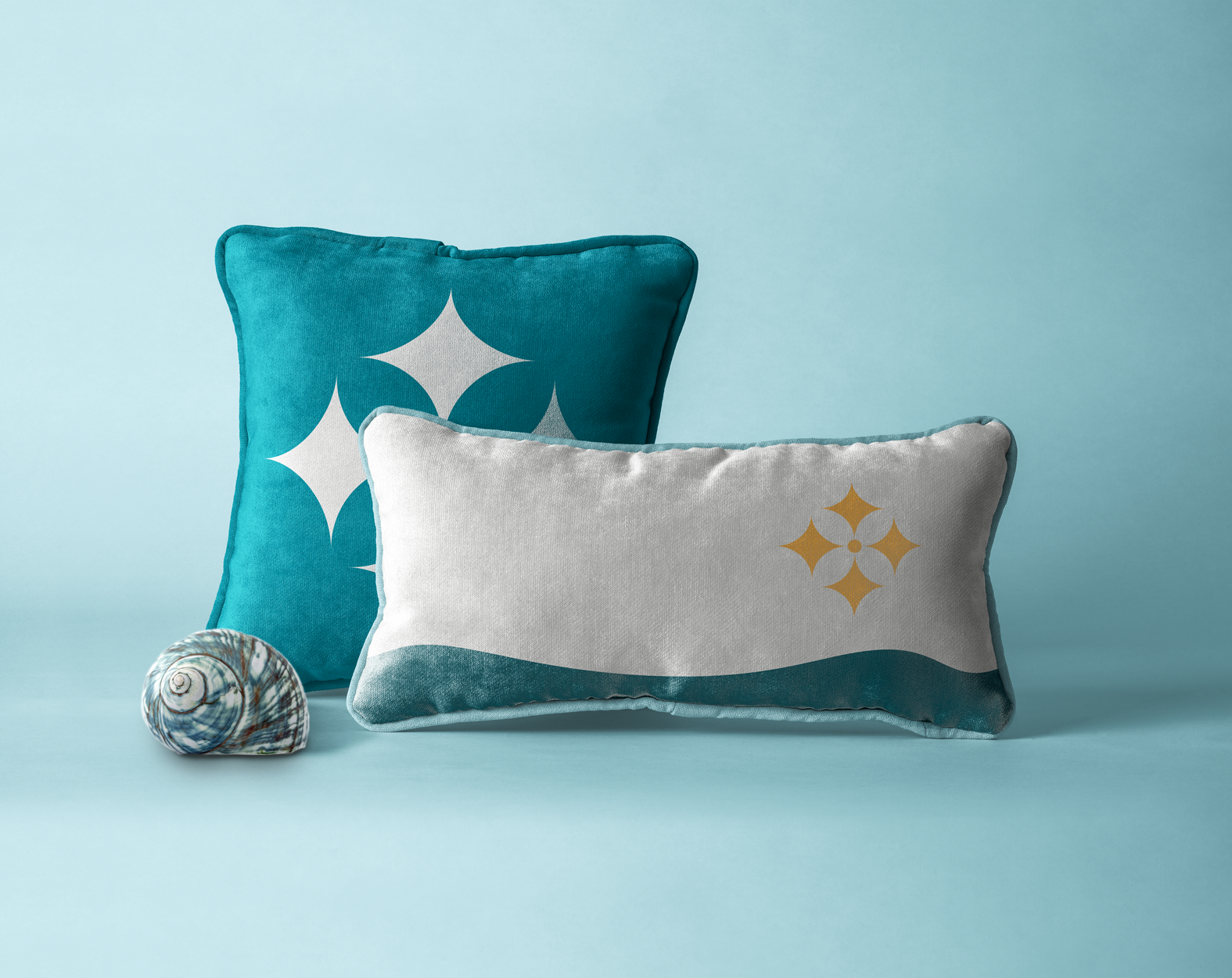
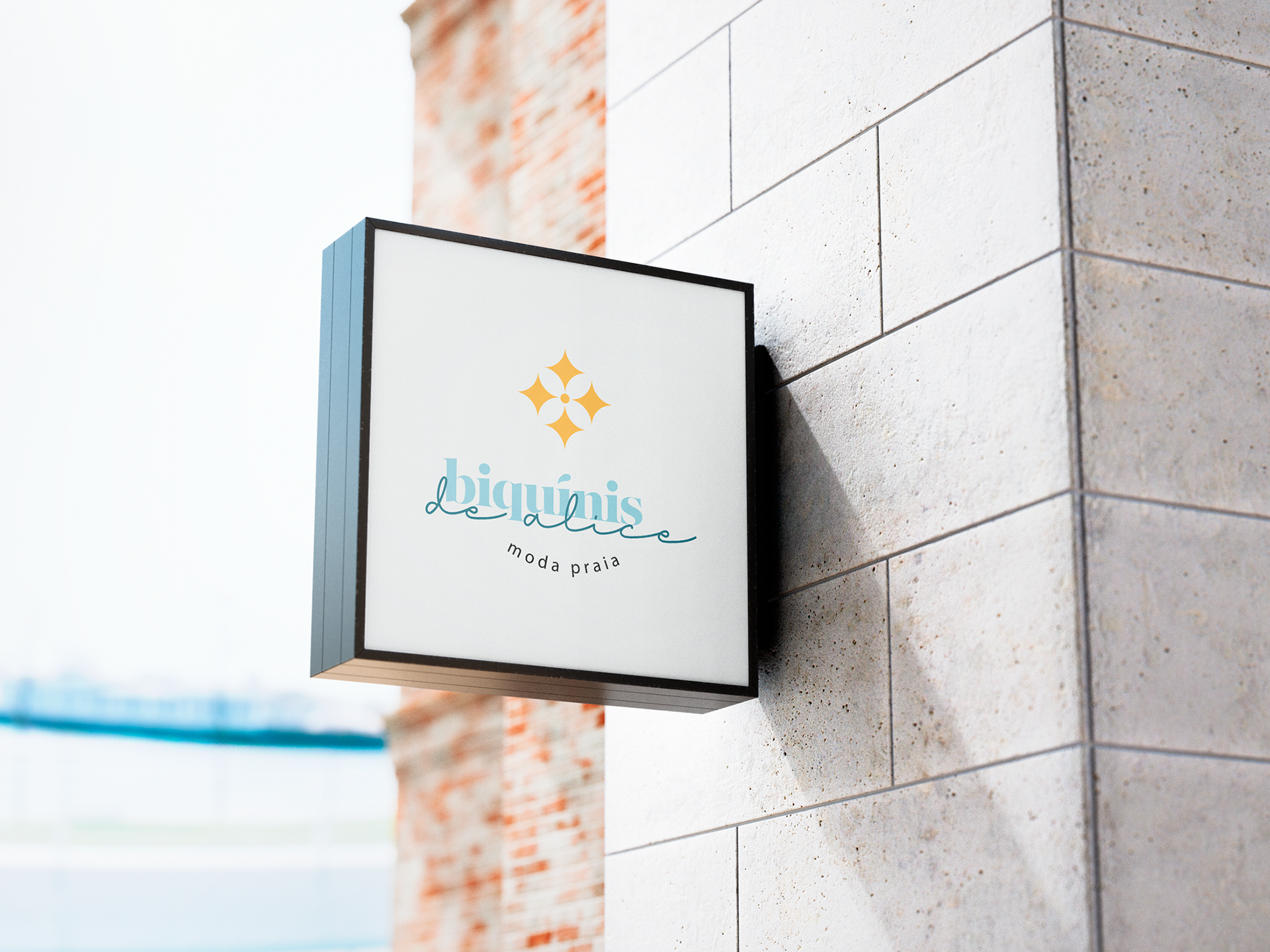
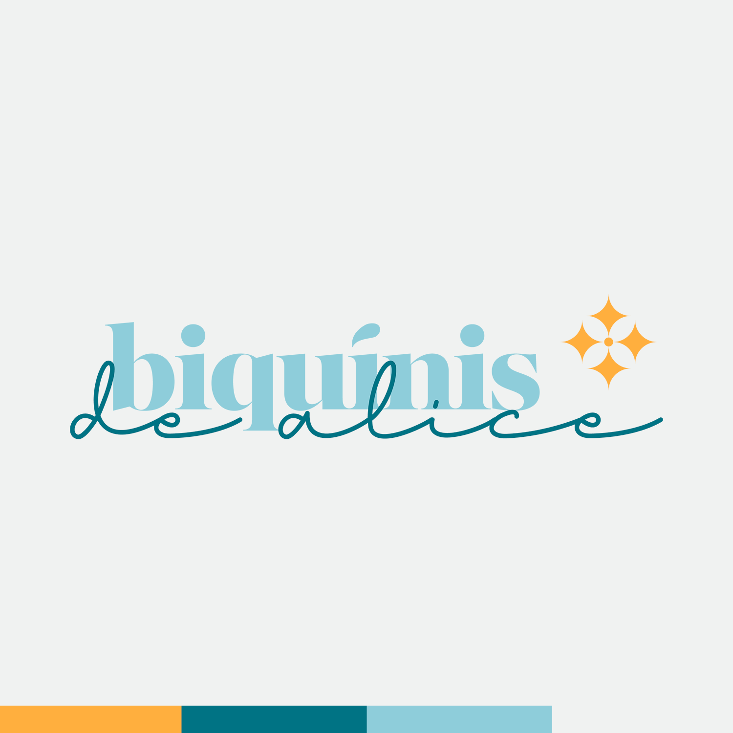
The brand symbol was built from a fusion of the “shine” icon in a diagram that refers to the shape of the sun, representing the shine that each woman has. possui
The colors were chosen by the analysis of color psychology and adapted to refer to the coast by the color of the sun, sea and sky. The typography combines an elegant serif font and a script font (indirectly in the form of sea waves)
The colors were chosen by the analysis of color psychology and adapted to refer to the coast by the color of the sun, sea and sky. The typography combines an elegant serif font and a script font (indirectly in the form of sea waves)
BR
_
O símbolo da marca foi construído a partir de uma fusão entre o ícone do “brilho” em uma diagramação que remete o formato do sol, representando o brilho que cada mulher possui.
As cores foram escolhidas pela análise da psicologia das cores e adaptadas para remeterem ao litoral pela cor do sol, mar e céu. A tipografia combina uma fonte elegante serifada é uma fonte script (indiretamente possui a forma de ondas marítimas)
As cores foram escolhidas pela análise da psicologia das cores e adaptadas para remeterem ao litoral pela cor do sol, mar e céu. A tipografia combina uma fonte elegante serifada é uma fonte script (indiretamente possui a forma de ondas marítimas)